Introduction
Welcome to the vibrant world of kitchen design where colour isn’t just an afterthought—it’s a defining trait. If you’ve been skimming through Pinterest boards or flipping through the latest issue of Architectural Digest, you know that the right kitchen colour combination can elevate your cooking space from mundane to magazine-worthy. Today, I’m unraveling the mysteries of kitchen furniture colour combinations so that you can transform your used-to-be-drab kitchen into a masterpiece of coordinate elegance.
Why Kitchen Colour Combinations Matter
In the increasingly visual world we live in, a kitchen’s aesthetic appeal is about more than just having the newest gadgets or the sleekest countertops. Instead, its true magnetism lies in the subtleties of its colour design. This emphasis means that choosing the right kitchen furniture colour combination can not only breathe life into your space but also subtly influence the mood and energy of the room. Imagine sipping your morning coffee amidst soft pastel hues that transport calmness, or hosting a lively dinner with bold, high-contrast furnishings setting the table for conversation. You’re not just choosing colours; you’re crafting experiences.
Finding Your Focal Point
Every visually striking kitchen starts with a focal point. First up, consider what you want to stand out. Is it the island counter? A vintage fridge? Or perhaps an entrancing piece of art that deserves the spotlight? Deciding this will help dictate the other tones you incorporate. Let’s say you’ve chosen a navy-blue island by Wellborn Cabinets (around $1,500), known for their premium finishes. This island can marry beautifully with lighter cabinet shades and metallic accents, instantly creating a dynamic look.
Think about it like an Instagram filter for your kitchen. The mood you set—whether it’s vintage charm, modern chic, or eclectic warmth—will guide your colour direction.
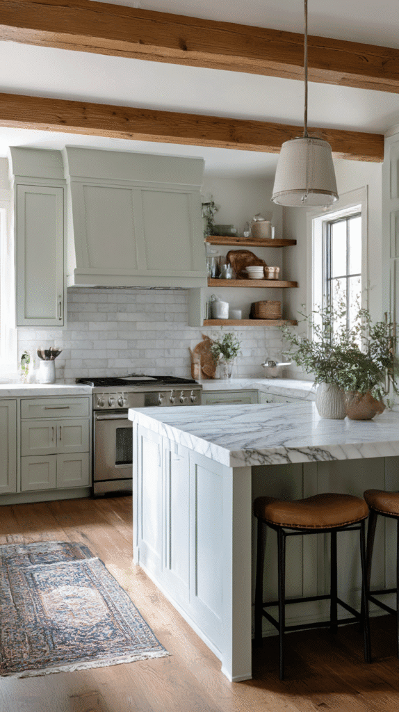
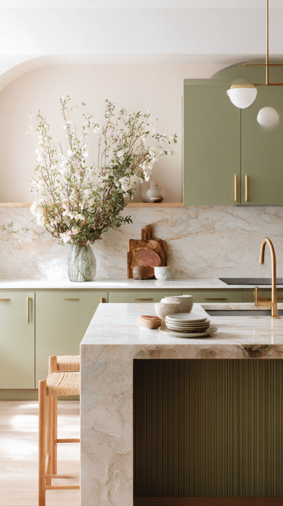
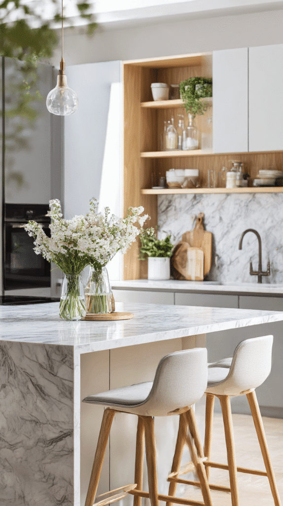
The Art of Layering Colours
Let’s dive deeper: the secret ingredient to an envy-inducing kitchen is the ability to layer colours artfully. This plays out much like piecing together an outfit. Your “shirt” might be the main cabinetry, the “jeans” could be the table and chairs, while the “accessories” are those delightful pops of colour, adding zest to your ensemble.
In Vogue Combinations:
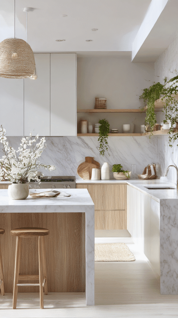
- Scandinavian Simplicity: Think light wood furniture paired with whites and soft greys. Ikea’s BJÖRKSNÄS series (starting at $299) masterfully captures this aesthetic, evoking the peace of a Nordic morning.
- Industrial Elegance: Achieve this with metals and distressed woods in furniture from brands like West Elm or Restoration Hardware, blending the rustic with modern efficiency.
- Eclectic Glam: Don’t shy away from bold hues. Mustard yellow stools by CB2 (around $139 each) matched with emerald cabinetry from brands like Semihandmade create a daring yet fashionable flair.
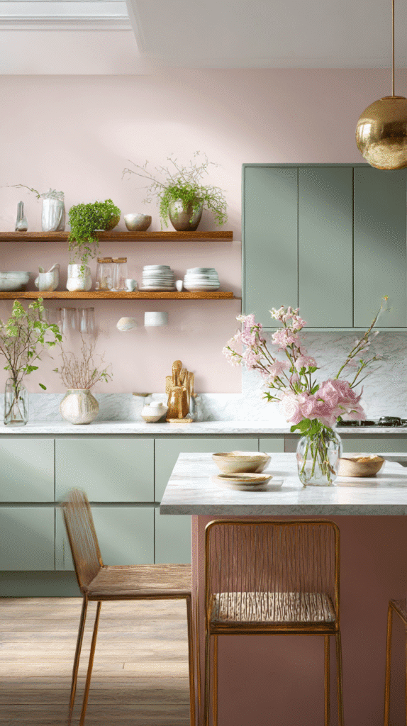
The Science Behind Colour Psychology
There’s more to choosing colours than what pleases the eye. According to colour psychologists and documented in frameworks used by leading experts on Houzz, colours affect emotions and behaviours, a potent tool if wielded expertly in your home. Warm tones like red and yellow usher in energy and stimulation—great for homes where the kitchen is the bustling heart. However, if your kitchen is a serene haven, you might veer towards blues and greens, which naturally calm and refresh.
Pro Tip: Experiment with chairs and stools by incorporating secondary colours that contrast with your primary scheme to keep your kitchen from feeling too matchy-matchy. The duality draws interest.
Real-Life Inspirations and Common Mistakes
We all love a great before-and-after shot. Take Erin, a home blogger who transformed her dated kitchen by swapping out dark wood furniture for light, airy maple tones that mimicked the open skies and sunlight through her large windows. Her kitchen became an Instagram sensation, earning her features in design mags like Domino.
Mistakes to Avoid:
One common hiccup is underestimating natural light. A tone that looks fantastic in strobe-lit showroom conditions can feel flat in a poorly lit space. Always test swatches directly on your furniture in the actual light conditions your kitchen experiences.
Another pitfall? Overdoing trends. Bright neon might be in today, but will it still be in your good graces in five years? Timeless elegance can be achieved with a base of neutrals, then accessorizing with trend-driven pieces that are easy to swap – think pillows, jars, or artwork.
Trend Forecasts for 2026 and Beyond
If you’re looking towards future-proofing your kitchen setup, you might want to keep an eye on what trends are anticipated to dominate in the coming years. Pinterest Predicts draws attention to earthier tones mixed with luxurious accents—a nod to a world seeking tranquility amidst chaos.
Expect materials like repurposed ceramics and glass making a comeback, with companies like Anthropologie and Pottery Barn leading the charge in sustainable chic designs. Matte finishes combined with splashes of gloss will continue offering depth and dimension, ensuring your space never lacks intrigue.
Conclusion
There’s no single right answer to crafting a perfect kitchen colour combination—each choice is as unique as your fingerprint. By focusing on strategic choices around your kitchen furniture, you set the stage for a space that works harmoniously in design and functionality. So go ahead, paint your palette with colours that echo the very essence of your home life.
Follow these insights, and not only will your kitchen dazzle aesthetically, it will provide a customized comfort tailored precisely to how you live, work, and enjoy your space daily. After all, isn’t that what good design is truly all about?